
Company Logos on Your Trades, Calendar, and Dashboard
A table of thirty open positions is a wall of text. Reading "NVDA" takes a beat. Recognizing the logo takes none.
As of this week, every ticker in Premium Insights shows its company logo — on the Home dashboard, in the trades table, and across the calendar. There's nothing to turn on and nothing to configure. Open the app and it's there.
Where you'll see it
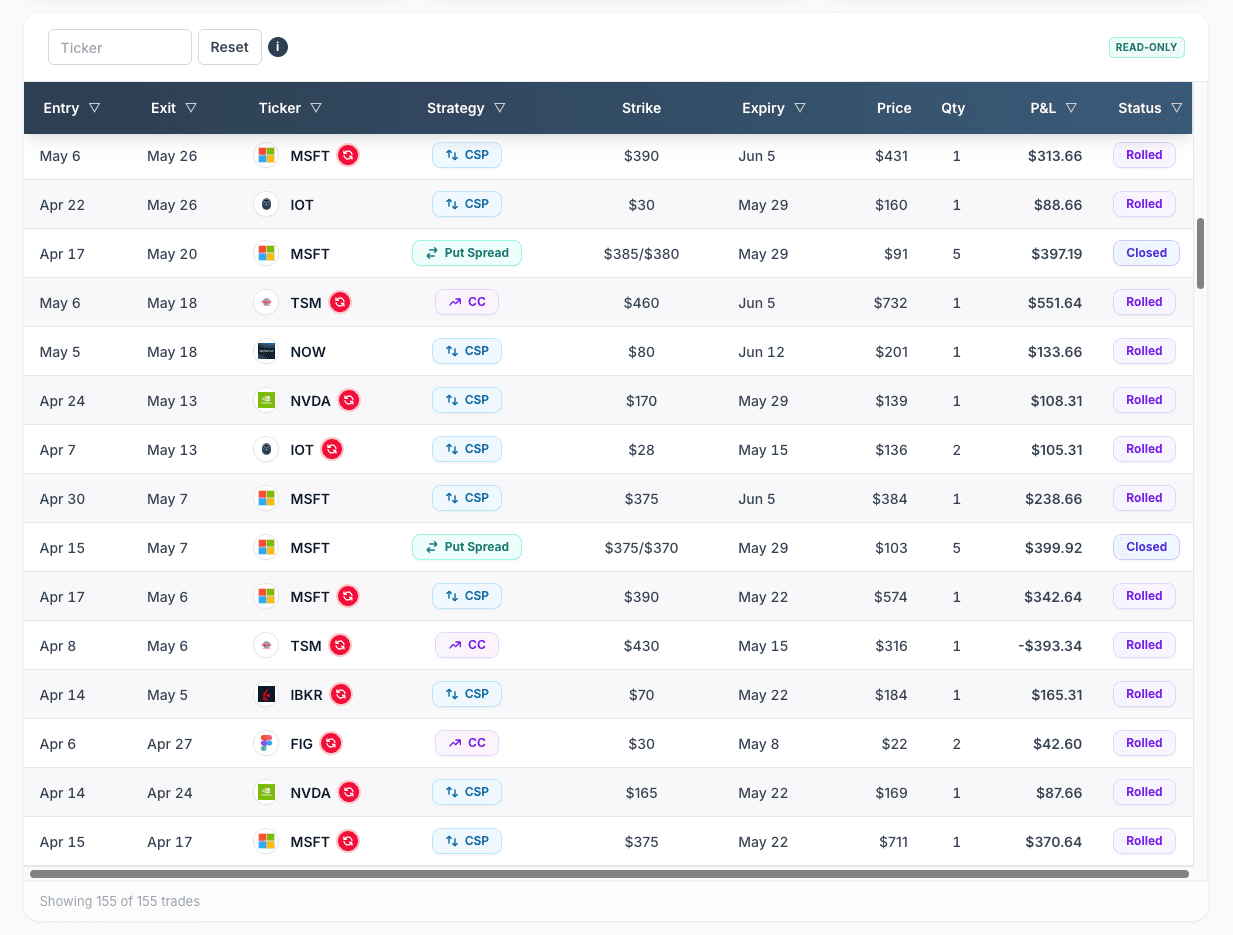
The trades table. Every row gets the underlying's logo next to the ticker, on desktop and mobile. When you're scanning down a long list of positions, your eyes land on the right row faster.
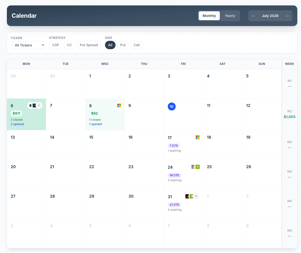
The calendar. Expiration days stack the logos of everything expiring that day. This is where the change earns its keep: the same logo showing up three times in one expiration week is a concentration signal you can catch at a glance, before you've read a single ticker.
The Home dashboard. Your open positions carry logos too, so the first screen you see each morning reads faster.
The details, since you'll ask
- Logos are self-hosted. We store them ourselves, so there's no third-party request when your pages render — no extra latency, no tracker.
- ETFs and indexes get a monogram. SPX, XSP, and friends don't have corporate logos, so they get a clean, consistent monogram — never a broken-image icon. Same fallback if a logo ever fails to load.
- It covers what you actually trade. The logo library is built from real underlyings in the product, not a token top-50 list.
Honestly, it's a small thing
This isn't a new analytics engine. It won't change your win rate. But you look at these tables every single day, and shaving a half-second off every scan adds up. We think a trade journal should be pleasant to read, not just correct — this is one of a steady stream of polish passes alongside the bigger releases.
If you're already tracking with us, open your Calendar — the logos are waiting.