
Introducing the New Premium Insights Design
If you sell premium, your journal is a screen you look at every day — sometimes several times a day. It should be a screen you actually want to look at.
Premium Insights was built page by page over the last year and a half. Every page worked, but they didn't all look like they belonged to the same product. So we rebuilt the entire interface from the ground up: every page, every chart, every table. The data and the math are unchanged. The experience is new.
Three things to know: the whole app got redesigned, dark mode is here, and Home is new.
A new design language across every page
The frame is new: a slate navigation sidebar (collapse it when you want the room), unified page headers, and cleaner typography and spacing everywhere. Menus and popovers got a frosted-glass treatment. The account switcher now shows each account's status at a glance, and your plan card in the sidebar finally says clearly what you're on.
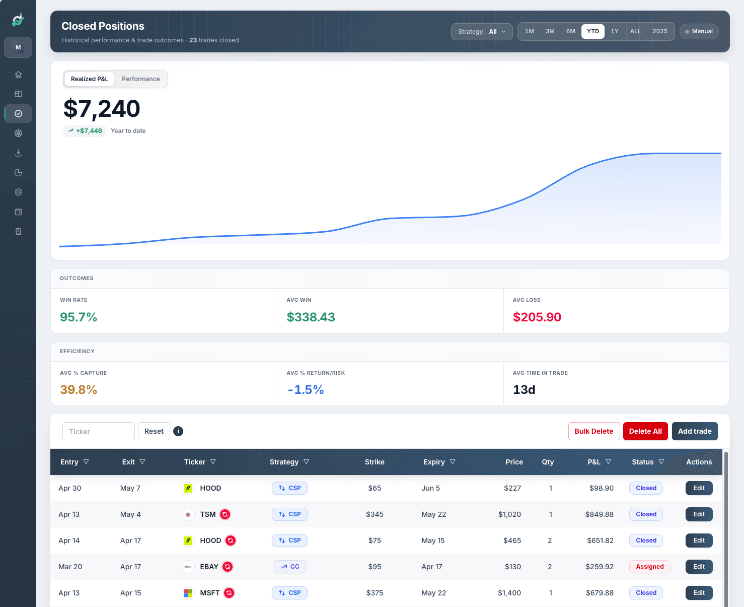
Inside that frame, every page was rebuilt: Home, Positions (open and closed), Stats, Income, Calendar, Journal, Wheels, Import, and Settings. Charts are bigger and tables are clearer. Strategy filters now live in popovers, so they no longer take up a row of the page, and closed positions are shown 50 rows at a time instead of one long scroll.
None of your numbers changed. This release is about how the numbers are presented; the math underneath is untouched.
Introducing dark mode in our new design language
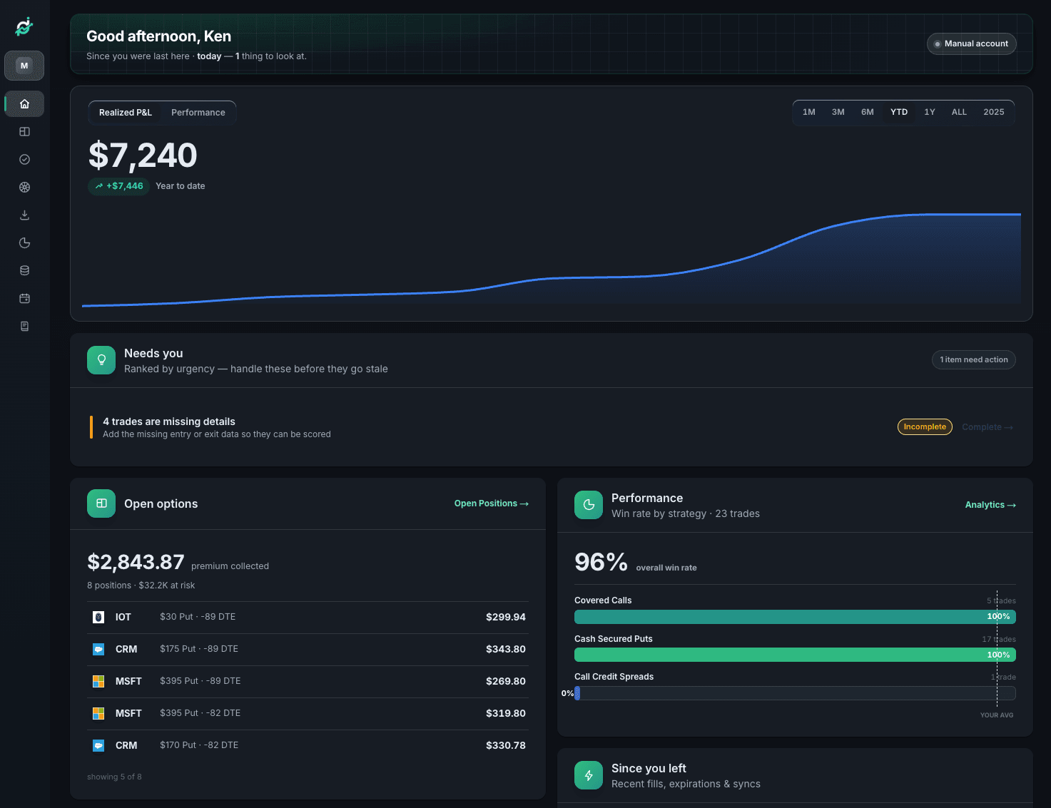
Dark mode covers the entire app: every page, every chart, every table, every popover. If you check positions in the evening with the lights off, or keep Premium Insights open next to a broker platform that's already dark, the app now matches the rest of your screen.
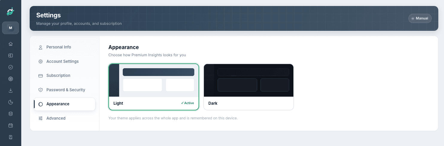
Turn it on with the Appearance switch in your profile menu (click your name at the bottom of the sidebar), or in Settings → Appearance, where you can preview both themes side by side. Your choice is saved per device, so you can run dark on the desktop at night and light on the work laptop.
A new Home, built around your day
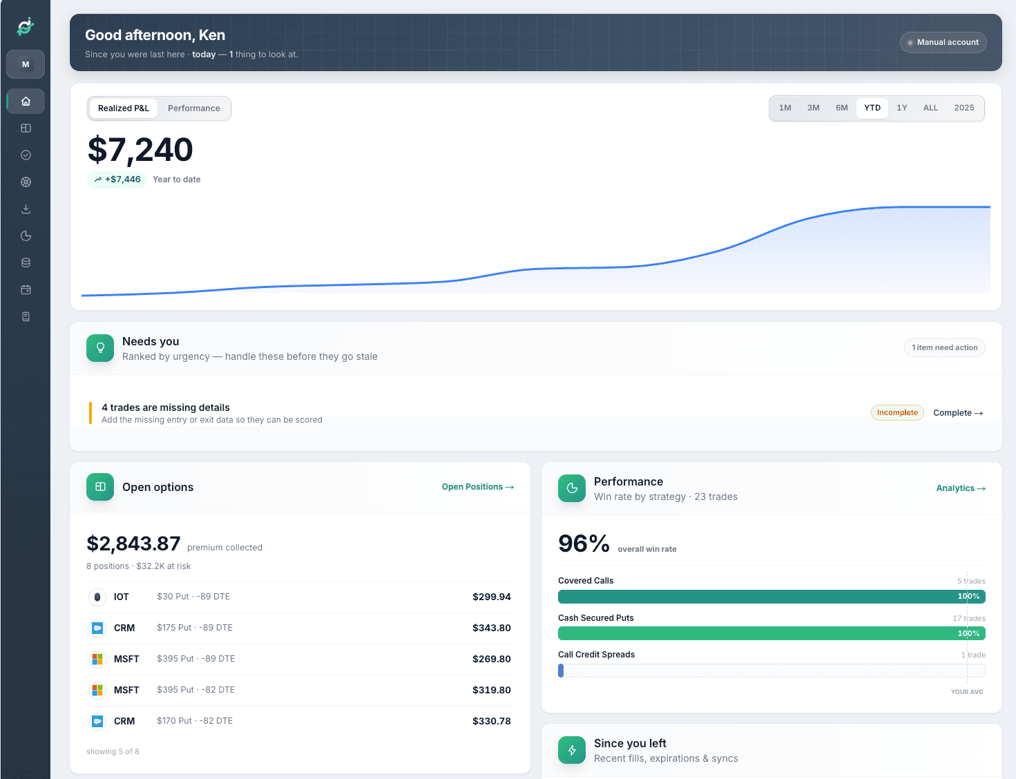
The old Home was a collection of cards. The new Home is organized around the two questions you open the app with: what happened? and what needs me today?
What you see now, top to bottom:
- A P&L hero with timeframe pills — your bottom line, switchable across timeframes without leaving the page.
- What happened since you were last here — an activity feed of opens, expirations, and closures since your last visit, so a few days away doesn't mean reconstructing events from your broker statement.
- Needs your attention — the items that actually want a decision, surfaced instead of buried.
- Your journal prompts and income flow — the reflection side of the journal, right where you start the day.
- A calendar with win/loss dots and expiration badges — your month at a glance: which days paid, which didn't, and what expires when.
If you're on the free tier
Pro charts now show a dimmed preview of the real chart instead of hiding behind a lock, in dark mode too, with a clear path to upgrade if it's a number you want. You can judge whether a chart is worth paying for by looking at it.
What stays the same
Your data, your numbers, and the math behind them. Pricing is unchanged as well: same tiers, same prices. This is a visual release. If a number looks different after the redesign, tell me and I'll look into it.
Take a look
There's nothing to enable. Log in and the new app is what you get. First stop: Settings → Appearance to pick your theme, then Home to see the new layout with your own book in it.
If you haven't logged in for a while, this is a good week to come back. The app you'll see looks very different from the one you remember. And if you've never tried Premium Insights, the sample dashboard you see on your first visit uses the new design too, so you can judge the real thing before importing a single trade.
We rebuilt this because you look at it every day, and we wanted it to be worth looking at.
— Credit Spread Investing
See the new Premium Insights
Log in and it's already there. New here? The free tier is permanent — import your trades and see your book in the new design.